Bring data to life
with Charts
GET STARTED Tell a compelling
data story
Communicate critical student
data in a colorful, clear, and
easy-to-understand snapshot.
Explore the benefits
Share your information in small, digestible data points to engage others and build consensus.
-
Synthesize
data
All your data points can
be mapped, from grades
to behavior, attendance
to services.
-
Demonstrate
results
Present evidence of student
growth or school improvement
to board members and
other stakeholders.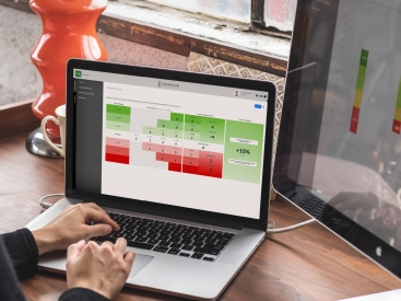
-
Save favorite
charts
Create a collection of charts
with your desired data display,
and re-render them anytime
to reflect current data.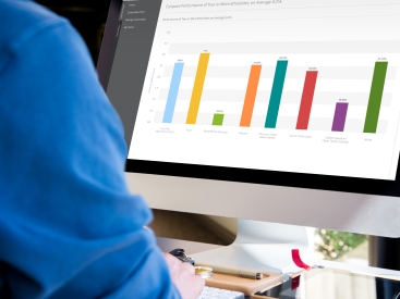
Instead of me having to recreate the wheel, I just make minor adjustments to a chart I’ve already saved and ship it out.
Barbara Moses
Director of Technology and Assessments, Toppenish School District
How it works
Charts can be shared in presentations or displayed on staff dashboards to keep your
most important metrics top of mind.
-
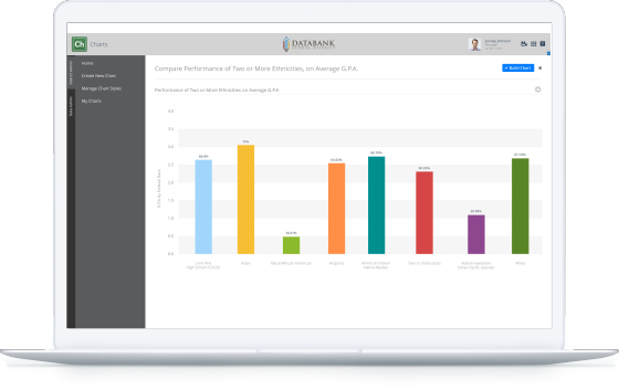
Align your academic, demographic, and
behavioral data to illuminate opportunity gaps. -
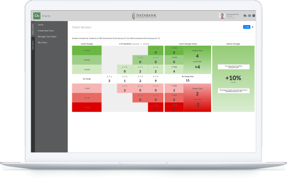
Measure progress of any cohort, from the
smallest subgroup to an entire school. -
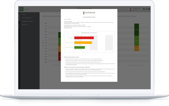
Attach descriptive text or analysis to
your charts for helpful context. -
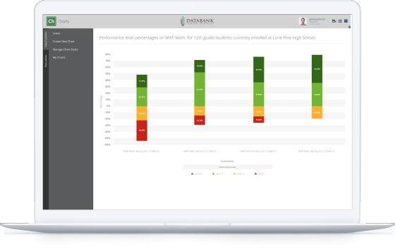
Monitor a group’s results over time
or on multiple assessments.

Paint a clear picture
of your impact.
Students’ needs and achievements
both become apparent with the
right visualizations.